There is no single correct answer — but the decision has a logic. Paper choice determines how a giclée print looks, feels, and lasts. Get it right and the print serves the work. Get it wrong and the work serves the paper — which is the wrong way around. This article explains how to think about the decision, what the surface categories actually mean, and where received wisdom diverges from measured reality.
What Fine Art Paper Is Actually Made Of
Fine art papers fall into three main substrate families. Understanding which family a paper belongs to is the foundation of every other decision.
Cotton rag is manufactured from 100% cotton fibre — the same raw material as high-quality textiles. It contains no wood pulp, is pH neutral, and on the highest quality papers is free of optical brightening agents (OBAs). Cotton rag is the most archivally stable substrate available for fine art printing. It is what museums specify and what the industry’s long-term lightfastness data is primarily built on.
Alpha-cellulose is purified wood pulp — acid-free and lignin-free. It is a legitimate archival substrate, used in many fine art papers and tested to museum standards. Longevity data is strong, though the depth of long-term testing is not yet equivalent to cotton rag. One important caveat: many alpha-cellulose papers contain optical brightening agents (OBAs), which cause degradation under UV exposure. For archival work, OBA-free is the specification to look for — regardless of substrate.
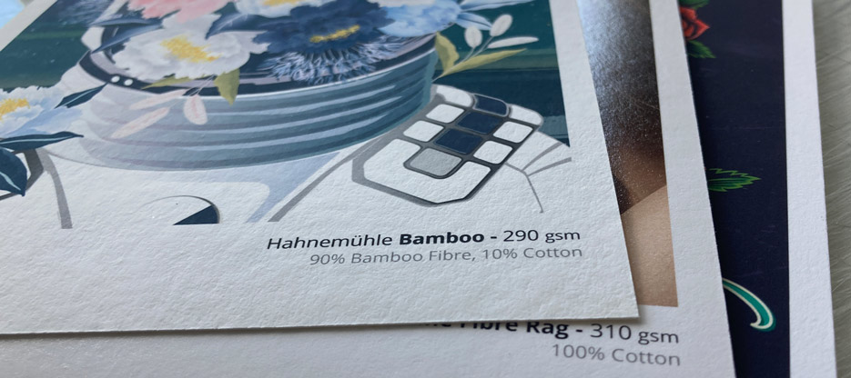
Alternative natural fibres — bamboo, hemp, agave, sugar cane — are used by Hahnemühle in their Natural Line range and represent a genuinely interesting category. The papers have distinctive surface character and aesthetic qualities. Long-term archival data for these substrates is less comprehensive than for cotton rag. For prints where long-term archival stability is the primary concern, cotton rag remains the better-documented choice.
The substrate determines archival behaviour. The surface determines everything else.
Surface Categories — The Starting Point
Fine art papers divide into two broad families. Everything else — texture, sheen, weight — is a property within those families.
Matte fine art papers scatter light diffusely rather than reflecting it directionally — which is why they read consistently under most lighting conditions without hot spots or surface glare. They feel like paper rather than a photographic product. Within this family, texture sits on a spectrum, not a switch:
- Smooth matte — flat surface, maximum detail rendition, neutral reading. The default for painting and illustration reproduction, and our own preference where the file supports it: nothing between the image and the eye.
- Light to medium texture — enough tooth to read as paper rather than print, without competing with fine detail. Works well for painting and illustration too — a middle ground between the neutrality of smooth and the character of heavier texture.
- Heavy texture — felt mark, grain, watercolour tooth. The surface becomes part of the print. Most forgiving for minor resolution shortfalls — tooth absorbs what smooth would expose.
Photographic fine art papers are defined by higher contrast, greater tonal depth, and output character closer to traditional photographic prints. Surface texture varies but tends toward smooth to semi-textured — heavy texture is rare in this family because it works against the contrast and perceived sharpness that characterise it. Sheen ranges from semi-matte through semi-gloss to gloss. Baryta is the most recognised paper within this family — its barium sulphate coating, photographic heritage, and characteristic smell straight out of the box make it unmistakable. But it is one type among several.
Some papers blur the lines deliberately — textured baryta, metallic finishes, specialty substrates that sit outside either family. Useful as a starting point, not necessarily a final answer.
Weight — Why gsm Matters More Than People Think
Paper weight is measured in grams per square metre (gsm). Most fine art papers range from around 200gsm to 400gsm. The difference is not just tactile — it has practical consequences.
Heavier papers are more dimensionally stable. They resist cockling — the rippling that occurs when ink load is high and the paper expands unevenly — and behave more predictably in a frame. For large format prints in particular, a paper below 300gsm can work against you — not because it is lower quality, but because a large sheet under its own weight and humidity variation needs structural integrity that lighter papers don’t always provide.
Lighter papers aren’t inferior — they have their place, particularly in edition printing, where cost per print and total shipping weight are relevant considerations, and on low ink-load images, where the risk of cockle is much lower even at lighter weights.
At Kilford, most of our core papers sit between 300gsm and 400gsm. That is not an accident.
What Paper Properties Actually Affect a Giclée Print?
At Kilford, we profile every paper we stock — building a custom ICC profile for each paper on our Canon imagePROGRAF Pro printers, measured with an X-Rite spectrophotometer. The profile tells us the paper’s actual behaviour: its contrast range, its white point, whether it reads warm or cool, how it handles shadow detail and highlight rolloff.
The result is data — not assumptions borrowed from manufacturer spec sheets. Some findings confirm what you’d expect. Others don’t.
White point is one of the more consequential variables. Two papers that look visually similar on a shelf can have meaningfully different white point characteristics — one neutral, one with a cool cast, one with a warm cream tone. For photography, a cool white point can work against warm-toned images in ways that are difficult to correct without compromising the rest of the print. For fine art reproductions where the original was painted on cream or warm-toned paper, a neutral white point can make the print feel starker than the original ever was.
Contrast range — the spread between the paper’s maximum white brightness and the deepest black it can hold — varies more between papers than most people expect.
Matte vs Photographic Fine Art: The Tradeoff That Isn’t Always Real
The conventional wisdom is straightforward: matte for a painterly feel, photographic fine art papers when contrast is decisive. That tradeoff is real — but it is not universal.
Some matte papers — by surface, by feel, by category label — perform significantly above where their category would suggest in terms of contrast and tonal range. Canson Somerset Enhanced Satin 330 is a case in point. By surface character it reads as a matte paper. By measured contrast range, it reaches a black density that standard matte rag papers can’t match — the difference is visible in shadow detail and perceived depth.
This matters for a specific type of conversation: the client who wants a matte paper and also wants the best possible contrast in their print. The conventional answer is that those two things live in different worlds. The measured answer is: often they do. Sometimes they don’t — and knowing which papers sit in that overlap is where the expertise lies.
That is precisely the conversation a Creative Guidance Session is designed for. We bring the profiles, the measurements, the papers and the expertise. You bring the work.
Best Paper for Photography, Painting and Watercolour Prints
Paper choice should follow the work — not precede it. Here is how the conversation starts, depending on medium.
Photography — Baryta is where most photography conversations begin — its contrast range and semi-gloss surface have photographic heritage for good reason. But white point matters significantly. A baryta paper with a cool white point can work against warm-toned work in ways that are visible and hard to correct. At Kilford we know the white point characteristics of every baryta paper we stock, and that knowledge shapes the recommendation depending on the image. For photographers who specifically want a matte fine art finish, matte cotton rag papers offer distinct options — each with different white point characteristics and surface responses that suit different photographic work.
Painting and illustration — The question here is usually about surface feel and tonal fidelity to the original. Cotton rag matte papers carry colour well and feel materially appropriate for work that originated as a physical painting. White point matters here too — a warmer paper suits work painted on cream or warm-toned ground; a neutral paper works better for work with cooler or more clinical colour. For work with strong colour and high contrast, a cotton rag paper with a satin surface and higher measured contrast performance is worth considering over a standard matte rag.
Watercolour originals — Texture is often the right call — and for good reason. On the right paper, a giclée can get remarkably close to the original. Some of our clients have been asked whether the print is the original. The surface choice is an intentional decision about how the work should feel on a wall, and textured cotton rag papers with watercolour or felt character sit sympathetically with work that originated on textured paper. The weight of the paper matters here too — heavier stocks feel closer to the original medium in the hand.
Mixed media and expressive work — For work where the surface needs to do the heavy lifting — mixed media, expressive painting, work with strong tactile intent — both heavier textured cotton rags and alternative natural fibre papers are worth exploring, each bringing different character to the print.
One more consideration worth raising: some clients choose to hand-embellish their prints after production — adding paint, pencil, or mixed media on top of the giclée. If this is the intent, paper choice changes significantly. Not all papers accept media well after printing; cotton rag and natural fibre papers generally perform better for post-print embellishment than very smooth or photographic type surfaces. It’s a conversation worth having before the paper decision is made.
Fine Art Papers at Kilford — and Why Each One Is Here
Every paper in our range has been profiled, tested, and chosen deliberately. Our core range is built around Canson papers — consistently strong specs, OBA-free across the range, and a breadth that covers most fine art printing needs. Hahnemühle brings a different set of strengths — surface character, substrate variety, and a fine art heritage that complements the Canson range rather than duplicating it.
The full range is on our papers page, with sample packs available if you want to see and feel them before deciding.
When a Test Print Makes Sense
Not every job needs a test print. For straightforward work on a familiar paper — a photograph on baryta, a clean digital painting on cotton rag — the profiled output is predictable and a test print adds cost without materially changing the outcome.
In most cases, evaluating the file on a calibrated, profiled monitor gives us everything we need to predict the output accurately. A test print is an option, not a default.
A test print earns its value when the paper decision is genuinely uncertain — particularly when it involves texture, sheen, or weight that can only be judged with the physical object in hand — when a client is committing to a large edition run on a paper they haven’t printed on before, or when they’d simply prefer physical confirmation before moving ahead.
One thing worth knowing: a print made outside Kilford — whether from a home printer, a regular photo service, or another studio — is rarely a useful reference. Printer, ink, paper, and ICC profile form a system, and it’s uncommon for two different setups to align closely enough to serve as a reliable reference. More importantly, a reference print the client loves isn’t necessarily a correct print. Chasing a third-party reference can become an expensive rabbit hole with no guaranteed destination. Starting from the digital file is almost always the better approach — and a test print through Kilford gives you a reference that’s actually grounded in your file, our paper, and our printer.
Test prints at Kilford are charged at regular print prices. For high-volume projects, we review whether a test print is warranted and handle the cost conversation accordingly.
FAQ
What is the best paper for giclée printing?
There is no single best paper — the right choice depends on the work, the surface preference, and the display context. For photography, baryta is often the starting point. For painting and illustration, cotton rag matte papers are the natural choice. For watercolour originals, textured papers tend to suit the work best. The most useful question is not ‘which paper is best?’ but ‘which paper properties matter most for this specific print?’
What is the difference between cotton rag and regular inkjet paper?
Cotton rag fine art paper is manufactured from 100% cotton fibre — pH neutral, acid-free, and archivally stable for well over 100 years under normal display conditions with pigment inks. Regular inkjet paper is typically coated woodpulp — it produces acceptable results short-term but is subject to yellowing and degradation over time. The difference in longevity is not marginal.
Does paper weight matter for giclée prints?
Yes — more than most people expect. Heavier papers (300gsm and above) are more dimensionally stable and resist cockling under high ink loads. For large format prints or any work intended for display, heavier stock is generally the right choice. Lighter papers have their uses — particularly for high-volume edition runs — but for display-quality output, weight matters.
What paper is best for photography giclée prints?
Baryta is the conventional starting point for photography — high contrast, gloss or semi-gloss finish, clear photographic heritage. But it isn’t the only answer. Many photographers specifically choose matte cotton rag for its fine art feel, softer contrast, and the way it reads on a wall without surface glare. The right choice depends on the image and the intent. A baryta paper with a cool white point can work against warm-toned images; a matte paper with a warm white point can add character to cooler work. At Kilford we profile every paper we stock and know the white point characteristics of each. That knowledge shapes the recommendation — not just the surface category.
How do I know which paper is right for my work?
Start with the medium and the intended display context. Then consider the surface properties that matter most — contrast, warmth, texture, finish. If the decision is genuinely uncertain or the stakes are high, a Creative Guidance Session is the most efficient way to make it: we review the work, bring the paper samples and profile data, and make the recommendation based on measurement rather than assumption. A sample pack is also a useful first step — seeing and feeling the papers in hand changes the conversation.